Saturday, 5 October 2013

017 Workflow and How To for "Master of Illusions"

Here is a quick workflow overview for my latest painting. 


 1. I had a very clear idea of what I wanted to paint. A creature conjuring an illusion to drive away some kind of treasure hunters.
I layed down a quick sketch for the composition, laying emphasis on foreground, midground and background in the values (from darker in the FG to lighter in the BG).
I first painted this in black and white, then layed a color layer on top and refine on a normal layer again. I also decided in this stage about my lighting.
The main light is the blueish-green coming from the opening in the ceiling, creating some rimlight on the foreground characters. A second lightsource is coming from the left off screen and is orangish-reddish.


 2. I refined the line sketches especially for the foreground characters and started to design out their armor/clothing


 3. I added some crude treasure coin pile with a quick brush I made. The brush is only ovals and circles of varying grey to black values set to scatter. Painting in B&W first and laying a color layer on top.
I completely filled the foreground characters with a brown tone underneath the line sketch and started to add light from both lightsources. I used a standard hard round brush and a standard soft brush.


 4. I started to refine the background more, painting the light and rocks of the cave with a chalk brush.


 5. Here I put a layer on top of the lines, starting to flesh out the illusion monster with basic, mostly opaque colors.
I also put a color layer on top of the foreground chracters to distinguish the clothing and hair from the skin. Then I put a normal layer on top to start painting out the lines and adding details. Still hard and soft standard brushes.
For the skin, I first painted with a hard brush, then using a blender brush (smudge tool with texture brush and spacing turned off on about 20% opacity) to gently blend in some areas where the transition would be softer, leaving some areas of harder transitions!


 6. Fleshed out the creature on the treasure pile and adding some smoke with a smoke brush.
Made some minor corrections to the illusion and detailed that more adding in more light form both sources.
On the foreground characters, I added an adjustment layer to correct the values in places to make them lighter.

Here´s an interesting method, I recently discovered to control value and color:

- Add a color layer and a luminosity layer on top of your image.
- Next add a new layer on top of everything and fill it with black. Set blend mode to saturation and you see your image in B&W. You can turn that layer on and off to check values.
- To correct color without influencing values, paint on the color layer while the black saturation layer is off.
- To correct values without affecting colors, turn on the black saturation layer, so that you get your b&w image and paint on the luminosity layer, picking values from your now b&w image.

I find that this gives me really good control over the image and rendering process.

The blue rim light is a layer set to divide (I never use that blend mode, but in this case, it worked )


 7. Refining details on the illusion, adding some glow on the red magic effect, the gold and blue light with a color dodge layer.


 8. Refining of the illusion by adding a slight phototexture and painting over it, working it into the image.
I changed the colors with a color adjustment layer to a more blueish-green and detailing out the treasure pile. Adding some treasure pieces and giving volume to the coins by painting in a dark rim on some of them
The foreground characters get more detail and using a soft round brush, I work out the skin. I also added some purplish tones around the eyes and a more red tone on the nose, switch hard, soft and blender brush, not using dodge or a color dodge layer


 9. Finally I added some curve adjustment layer, a color balance and hue layer to correct the colors (especially to bring out the red light source on the left) Remember that those adjustement layers have mask layers! Use them to get your adjustments to the spots you really want altered, not to change the whole image!
Painting in a stronger, detailed rim light and adding a slight noise filter and the painting is done.


Wednesday, 11 September 2013

016 Anatomy of a Color Study and Workflow

I thought, I´ll post a bit about how I create a color study.

Create quick brushstrokes for the background. Here the BG isn´t that important and was blurred out in the photo anyway. Make sketchlines to indicate the rough figure. Doesn´t need to be a clear supertight lineart as it will vanish in the course of painting. Create separate layers for BG and lines!

Next I create a layer underneath the line layer and slap on some basic tones of color. I try to get sort of a middle value of each different material. Be loose and sketchy here.

Next start to add some shading (e.g. here visible in the lighter tones of the cowl). I also start detailing and cleanup. Here I used the pen tool to get clear and sharp edges for the warhammer and shoulder armor.

Go from space to space and continue refining and cleanup. I first finished all metal parts before going to other areas.

Once all areas are cleaned up and correctly shaded, go over the whole image and start the detailing phase.                Original image: keirea.deviantart.com
 I found that this workflow is what suits me best, even when not doing studies. I used to do lots of black & white renderings and applying color later paintings, mainly to get my values somewhat right, but I feel it is too cumbersome for me.
The advantages of this workflow are speed and an included color sketch. The downside: you have to choose your color scheme very early on.

TIPP: You can always easily check values on your color paintings by just adding a layer ontop everything in PS, fill it with black and set blend mode to saturation. You can turn this layer on and off to check your greyscale values.

Monday, 9 September 2013

015 Color studies

To be able to increase the quality of my paintings, especially rendering, values and color, I decided to do more color studies.
In doing so, you "copy" a photo or something from life without using the color picker in photoshop. This is essential, because you are forced to judge values and colors with your own eye, hereby training it to see.

As I mentioned before, it is really important to NOT blindly copy the image on autopilot, but observe the image and try to memorize why something looks the way it does under certain lighting situations. Here are some examples:


Original photo: mjranum.deviantart.com

Original photo: mangrasshopper.deviantart.com

Best results for memorizing are achieved, if you use reference for something you want in a final image, study (paint) the reference material and apply to you own images, e.g. you want to paint leather armor on a sunny day, find reference (no need for it to look exactly the way you want, it is all about studying how something looks), paint it without color picker and apply what you learnt to your own supercool armor.

Tuesday, 27 August 2013

014 Time for Comparison

It has been three years now, since I decided to get serious about art. I made my first attempts at digital painting and one of them was a group portrait of the characters in my RPG party. The system we played was (better make that is, the group is still in existence) Das Schwarze Auge (The Dark Eye). It is a very popular game among german speaking countries.

When I finished the group portrait, I was kind of proud and very pleased with the outcome. Three years later, I can barely look at it :) So I decided to redraw the group portrait to compare my skill levels and analyze where my flaws still are. Here is the before-after:

Before
After

I improved a lot regarding figure drawing and color&light. Still, I need to create more dynamic poses, more natural faces and brush up my compositional skills.
Onwards to more paintings!

Thursday, 18 July 2013

013 Level ups and downs...

While learning to draw, you sometimes get what I call a Level-up. There are certain points where you suddenly "get" things.
For instance, you study perspective and draw and draw, study and study and you have the feeling that nothing progresses. But suddenly out of the blue something clicks in your mind and your mind understands. You get euphoric and feel like the king of painting able to do anything.

The downside to this is, at least for me, it is usually followed by a down where you think, you are not good enough for anything. After getting over that, the cycle starts anew.

While annoying, this down is actually not so bad, as I have discovered. You get this down, because you look differently at your work, with a new skillevel, and of course you value things differently now. The "secret" is, keep drawing no matter what!

Here is an example of my recent levelup/down.

Regarding figure drawing, especially from imagination, I was doing so-so, nothing really great.

I started doing studies of pencil drawings watching lines, proportions,...(this here is a study from alexpascenko.deviantart.com)

More studies... (here from John Howes concepts for The Hobbit)


Jumping to these figure drawings done from imagination, applying what I learned through studies
My down this time was, I couldn`t do proper gesture drawings any more, especially with a fast timer (30 sec- 1 min) The outcome would always look unsatisfying. After a few days, it hit me why. In my gestures I never properly cared about proportions, just to get the motion somewhat down. So I had to "relearn" gesture with regards to proportion...it never bothered me before my Level-up.

012 Back to Basics

In the last few weeks and months, I decided to strengthen my foundation skills. I studied perspective and mostly figure drawing, anatomy and proportions. It is good to go back to the basics once in a while, even if you´ve drawn for a long time, especially if you´re selftaught. I also concentrated on making my digital linework better.
So I went from:

to this:

The key is of course studies, studies, studies. Do not copy what you see, concentrate on the linework. Consciously draw your lines, be careful about lineweight (thicker lines on shadowed areas, thinner on light areas)
It is also important to make confident lines. The first images shows mostly scratchy lines, scribbling away, not thinking about the lines I made.
In the second image, I concentrated on the lines I wanted to make, ghosting over the areas where I intended to put them and when I was sure, I drew them. 

Wednesday, 17 July 2013

011 Graphic tablet painting quick tipp

Some beginning artists are really good with traditional media when they start out, but switching to a digital tablet is hard for them. I´ve been there. The tablet doesn´t respond like e.g. a pencil, where you can feel when marks are left on the paper. On a digital tablet it just is too smooth without much feedback.
Here is a quick tipp:
Tape a piece of paper to your tablet! It is a whole other feeling when drawing digitally. It won´t make you a better artist, but it sure helps.


You can even put a whole stack or a sketchbook on top, which gives you an even softer surface.

Sunday, 6 January 2013

010 Painting Process, Brushes and Tools

I posted some quick sketches this week on deviantArt and someone there asked me, if I would consider to do a speedvideo of my painting process, because he would always get good sketch results with pencil, but because Photoshop can be quite confusing with its millions of tools, his sketches lack digitally.
I watched lots of these kind of videos and I really can say, I learnt nothing really essential from them. It´s nice to see how someone goes about and see the creation of a painting, but seeing it sped up to 10x speed, you really can´t tell what important processes are happening.

I am however considering to do some tutorials within the next months (once I get better and to a level, where I feel, I can teach something about painting...)

Photoshop can be a taunting application, especially for someone who hasn´t used it a lot. One advice would be to find good video tutorials of all the tools in Photoshop, so know what you can and can´t do with them. The tools for painting I use frequently (or all the time) are:

Learn these tools, combined with a knowledge of how layers and layer blending modes work and you have the basic technical knowledge for drawing digitally. The key is practice here. I do not even think about the functions of each tool anymore, because I just intuitively select and use what is right.

Speaking about brushes. The brush tool is the single most important tool for the digital artist, but most people just simply overestimate the brushes or brush collections. Having cool brushes is neat, sure, but it is not the brush that creates art! You can paint anything with just a single brush! That brush would be the hard round brush. Sure there are nice texture brushes for foliage, rocks, chains, etc. but they just save time and won´t turn a bad painting into something wonderful. Your knowledge of the basic drawing skills (perspective, line quality, proportions, anatomy, form, etc.) is what makes your art good. So practice those!

There is a difference in drawing with a pencil and drawing digitally. I sometimes still have the feeling, that my pencil drawings are easier done than a digital sketch, but that is simply because of the way how you draw with a tablet. Drawing on a piece of paper, you always look on the paper, seeing your pencil making marks. With a tablet, you look in a different direction than where you are drawing. But this is nothing that can´t be fixed. The key again is practice. Draw as much as you can digitally, no matter how bad it looks and learn about line quality.

Line quality is a term that refers to how confident your lines are drawn and how much "weight" the line has. Here is what I mean (not a perfect example :) :

  
1: Here the line is draw with smaller lines consecutively drawn. Avoid this!
2: The line here is one single stroke
3: Line weight is applied here. The darker/thicker lines on the cube indicate shadow.

This also needs to be observed for traditional drawing! So you see, that line weight can indicate light and shadow without rendering areas.

To achieve a more confident stroke, draw from your elbow and shoulder rather than with your wrist or fingers.

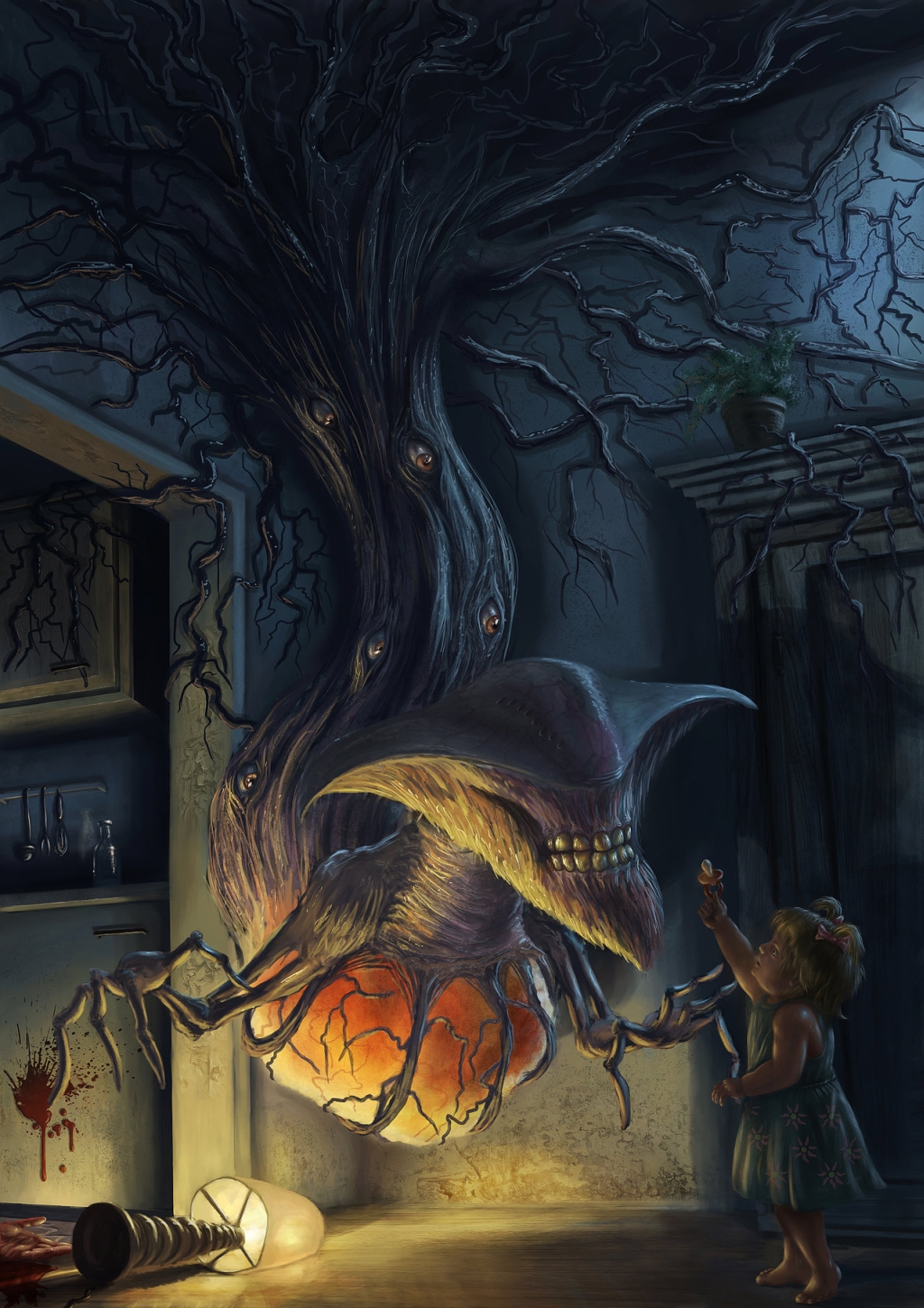
Here is a little process shot for a painting a did:


So from top left to bottom right, here is my process for this painting:

1: Establish a composition, perspective and creating focal points (the creatures head). Keep the sketch very loose and messy, as the lines will be covered by paint.

2: Create a color palette and a basic lighting scheme. Also keep it messy. No details whatsoever! You need to get the overall picture right. Work from general to specific.

3: Refine the lighting scheme and start blocking in basic color

4: Slight correction of perspective and tidying up the background color blocks

5: Working on the creature, blocking in colors and shading in one go (light from the lamp, core shadow and light from the offscreen window)

6: Blocking in colors for the girl. each area only has one color value

7: Base shading of the girl with shadow and highlights

8: Detail is added (eyes on the creature, plant pot, blood stains) and some texture overlay is worked into the painting

9: Cleanup and detailing work (lightest highlights, etc...)


Regarding painting processes:

I seldomly use a fixed concept for painting. This process above was used for this specific painting. Sometimes I make a refined line drawing after the sketch phase, sometimes I use no lines at all. There is no fixed procedure.

Hopefully someone gets some knowledge out of this post. Feel free to ask, if you have any questions.

Wednesday, 12 December 2012

009 Gestures

As some  might know, a gesture drawing is a quick study ranging from 30 seconds to 5 minutes. It is mostly  used in studying the human form.
You try to capture the essence, flow and rhythym of the pose without going into details. I have known this method for a long time, but only recently, I started to regularly make gesture drawings. And this really helps a lot, as you learn to quickly see the form and flow.

Here and here are links to some gesture drawing tools, which change pictures after a set amount of time.
I mostly use the second one as it also has models without skin (only 3D models, no humans were harmed in making them), so you can use it for anatomy observations as well. And it has camera angles that wouldn´t be so easy to do with  a real model.
The first link has photos of real people also with clothes, which is a different sort of gesture drawing, because the clothes sometimes change the form.

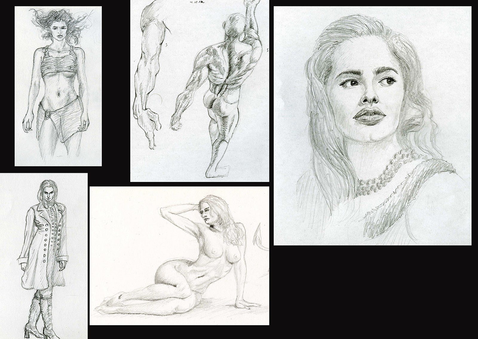
Here are some examples from the last 2 weeks (there are also some studies that took longer...and some doodles):

Gestures and some studies

As you can see, the drawings do not have to be perfectly beautiful pictures with perfect proportions and rendering etc., the main goal is to get a feel for poses and the flow of the human body in motion.

I try to do a couple of these gestures every day, because they are fast to do and you learn a lot. I can highly recommend this to anyone, who wants to learn how to draw the human figure.

Tuesday, 11 December 2012

008 Speedpainting and the Revenge of the Stressful Timer

Last weekend I attended a live speedpainting event hosted by a deviantArt group. I managed to participate for a few hours and it basically goes like this: you get a theme and you have 30 minutes to come up with a concept for it. It was the second time I took part and I can really tell you, I learned something. Not essentially about painting itself, but how your mind influences your work.
I have already done speedpaintings before, whether from my mind or with reference (these are more studies than speedpaintings), but painting with a set amount of time for yourself or painting with a given amount by others are two completely different things. Stress and adrenaline start to rush, when the timer starts to tick time away, nearing the inevitable 0:00. It´s kind of like taking an exam :)
The first time I participated, my mind was too distracted by that and I even changed my paintings and started all over again after half of the time finished. This was the awful result:

Speedpainting theme: insect predatory creature

 I usually do not start out a painting with much structure and it doesn´t matter how long this phase takes. But within a time limit of 30 minutes, you have to have some kind of structure and organization.
So this time I focused and ignored the timer in my head and tried to bring in some structure. Starting from overall messy general idea to a somewhat nice painting. Results this time where, at least for me, much better:

Theme here: Futuristic SMG
A somewhat exhausting, but very fun task this time was painting for 2 hours straight and finishing 4 speedpaintings:

Themes: Mythological creature, sadistic villain, forest hut and subtle fairy

While the concepts themselves are not very original, I´m quite satisfied, because the event taught me something about time management and structure. Something that also is a vital component in learning how to draw and paint. Time leads to more images, more images lead to more practise and more practise leads to better images.

Tuesday, 27 November 2012

007 To Reference Or Not To Reference

Sometimes the question arises, if you should use reference or completely draw everything from your mind. Some people see using reference as something weakening or not art-like, because you are essentially copying things.
While it might be true, if you are doing a 1:1 study from a photo, it might be nothing more than copying, it is essential for any progress. How can you paint from your mind, if you don´t really know how something looks?
You have to have a huge visual library in your head to create something completely without reference.
And to build that library, you have to observe how things look. The best way is making studies like this:

Color study

In studies like this, you observe the form, lighting and colors of the reference image (without using the color picker in Photoshop...).

You can also incorporate studies into your finished images, if you come to a subject, you are not really familiar with:

1:1 reference

In my recent painting, I came across the problem, that I haven´t painted a sheep before. So I used reference and combine this study with the final image. Next time I have to paint a sheep again, it should be less of a problem.

The best way to use reference in my opinion is not copying it 1:1, but changing it. In another painting I ran across another problem: painting children. I have been studying anatomy for quite some time now, but a child´s anatomy follows totally different proportions. So I used a reference image, but changed it slightly and added missing parts on my own, not relying 100% on the reference image:

Slightly altered reference
I changed the left arms position, the right hands fingers, the hair style slightly and I show more of the face at a slightly different angle. Legs and feet were added without reference using my humble knowledge of anatomy and balance in figures.

Reference is especially important in learning about the human figure, whether it´s from a photo, a drawing or from life. It took me a long time to be able to draw the human form from my mind now, and I´m still only at the start of grasping it fully.

Here are some sketchbook examples of drawing with reference:

Referenced sketchbook images

And here are some examples of drawing completely from my mind:

Sketchbook examples from imagination

As you can see, my faces and head drawings from imagination are starting to get better. As for the full human figure it mostly still lacks that flow and rhythm a figure needs, to be dynamic and alive and not too stiff. I know how the anatomy should look like and how the proportions are suposed to be, but I still have trouble to capture a natural, dynamic pose

My goal is to be able to draw anything from my mind, especially the human figure, but it still takes a lot of time and foremost studies! So go out and study and observe everyone!

Thursday, 15 November 2012

006 Status Now, Goals and Tips for Beginning Artists

I learned a lot about drawing and painting in the past two years, even more than in the rest of my life before. But it wasn´t easy and I had to discover lots by myself.
I can´t possibly squeeze all the tiny bits I acquired into a few blog posts, but as this blog is supposed to track my progress, I can sometimes give tips and share my experiences in future posts. These will always be biased as they are, well, MY experiences, taylored to my learning process.
Everybody learns stuff differently and I don´t have the overruling word when it comes to learning how to paint/draw. There are just too many methods, systems and whatever out there and everybody has to find out for him/herself what suits him/her best.  I´ll also try to answer questions, if someone wants to know something about specific topics.

So for starters, here are some source materials (mainly on figure drawing as I focused a lot on that subject), that I found very helpful in learning to paint/draw:

Books about figure drawing:
  • Andrew Loomis, Drawing the Head and Hands
  • Andrew Loomis, Figure Drawing For All It´s Worth
  • Bridgman´s Complete Guide to Drawing From Life
  • Burne Hogarth, Dynamic Figure Drawing
  • Michael Hampton, Figure Drawing - Design and Invention
Books related to figure drawing:

  • Burne Hogarth, Dynamic Wrinkles and Drapery
  • Gary Faigin, The Artist´s Complete Guide to Facial Expressions
Books on painting: 

  • James Gurney, Color & Light
Video tutorials on figure drawing:

  • David Finch, Dynamic Figure Drawing Series at Gnomon Workshop here
  •  Glenn Vilppu, Figure Drawing here
General video tutorials on painting/drawing:

These are just a few sources you can get your knowledge from. There are lots more out there, some free, some not, but these mentioned sources helped me a lot.

 For beginners, here are a few tips to keep in mind:

  • Get yourself a sketchbook and keep it with you every day
  • Draw as much as possible each day, but don´t see it as work. Keep the fun in it!
  • Use spare time to draw everywhere. On travels, waiting for the bus, ....
  • Start to really observe the world and your environment. Study all the forms you can see, how color and light behave in certain situations, where do shadows fall and what colors do they create (shadows are not entirely black...), why does a person look like he does (placement of facial features, hairstyles,...), etc.
  • No matter how bad you think your drawings are, you always learn something from them just by drawing
  • Build up a visual library in your mind of objects, faces, environments, lighting conditions, etc. It really helps when drawing from imagination.
  • Draw from reference (photos, from life,...) and after finishing, put away the reference (or walk away from it) and draw it again from your mind.

Here are some of my more recent paintings and drawings, so you can compare the progress with my earlier posts:


The paintings where done fully digital with some reference (like parts of the child in the last painting and some landscape photos on the first one).  All drawings are from my recent sketchbook with no reference, just from my mind.

So regarding my immediate future goals, here they are:


  • Study anatomy till I drop dead or finally get it into my head completely
  • Create more dynamic, lively figures and faces that could jump right off the screen
  • Study facial expressions till I´ve had enough of smiling, crying and angry  people
  • Draw hands, hands, hands and some more hands
  • Drapery and clothes are not my enemy....I just have to study them more
  • More realistic color palettes and lighting
  • Moodier atmospheres in paintings
  • A more realistic look and feel to my paintings
  • Going right to ludicrous speed when painting. I am like a snail now (can´t really train that. It´ll come with time and practice)
So, there is a lot to do. Let´s make it happen! 

Wednesday, 14 November 2012

005 To the Future and Beyond

For the next months I was constantly learning and painting and also decided to enter some contests at deviantART, which are very fun. No matter how good or bad your skill level is, I can recommend to everyone to enter in contests. It´s not necessarily about winning, but more about learning. You have your deadline to enter your work and a theme not chosen by yourself. To me they are like homework assignments and great to keep you motivated when studying by yourself. The different themes also kind of force you to paint things you are not familiar with.
My first contest entry had a vehicle theme and I had never even really thought about painting vehicles. So I was "forced" to think about how to solve that problem. This was the result:


Some people also started to ask me about commissions and I even was invited to contribute some of my work to an artbook, which can be found  here.

My confidence level started to rise and that led me to lesson nr. 3:

Confidence is your ally!

This might sound stale and blunt, but there really is a connection to quality work and confidence. If you´re confident, your work will be better. With better work, your confidence rises. The problem with confidence is, it can be shattered easily, if you don´t take care, which might result in demotivation and bad work.
Sometimes I produce stuff I am really not happy about. If that happens, I just get rid of it. Don´t try to fix a mostly complete painting you are not happy with! You´ll learn something, even from bad paintings, but there is no reason to but in extra effort and time to fix something that will most likely be mediocre at best.

But don´t give up too soon on a painting either! When I start painting, I´m mostly never pleased with what I produce up until I spend about an hour or so on it. It took me a while to find out that paintings need to grow from a general blob of colors to the detailed nice look you want to reach. At least for me, they never really feel right at the beginning. But you have to have patience and believe in your abilities.
Here´s an example of what I mean:


This is a WIP file for a recent Halloween painting. It shows the various stages of the painting. Stage 1 is almost always the stage I have to overcome to be satisfied with the image. As I learned, it is also one of the most vital steps of a painting, as it determines color, composition and overall mood right at the beginning. Once I´m at least quite happy with this step, then I can proceed.

004 Perfectionism Isn´t Always A Good Thing

I am sort of a perfectionist, especially in things that require creativity. And while this is sometimes a good trait that leads to satisfying results, guess what: in painting it can stand in your way!

I soon discovered, that I started my paintings with the premise that it had to be flawless. Everything should be supercool, equally lit and equally detailed. The result of that premise was that I started to tighten up even in the beginning phase of a painting. It took forever to make and I always jumped into the details as soon as possible. It was also acompanied by a kind of fear of making mistakes. Considering the possibilities of digital painting, this was of course stupid. And even if you make mistakes, there is no such thing, only happy accidents :)

One day, I sat down and had an idea for a painting. A group of minotaur heroes, entering a dungeon (this was a joke from one of my D&D sessions). I decided to make the background first and try consciously not to cramp while painting. I listened to some music and made some sketches to warmup and then I just painted, not caring about "mistakes" or flawlessness. The result was this:


The only reference used was photos of me in various poses and some photos of cows from the net. This was another milestone for me, as the result was better than anything before. Just by loosening up and not really caring about the perfect result. There was kind of a flow or vibe while painting, something that is always present when I work nowadays. It´s an indicator for me to tell, if I´m on the right way. When this vibe is not there, I know, I have to stop painting immediately and do something else to loosen up again. 

Tuesday, 13 November 2012

003 So how DO you actually start being an artist?

So after all my ups and downs so far with my drawing skills, about 2 1/2 years ago in summer 2010, I decided that this was it. After thoroughly asking myself, what I wanted most in life, one sentence always popped up in my mind: I want to be an honest-to-god artist.

But how on earth do you become an artist? What is an actual artist? Looking at the works of Boris Vallejo, Ralph McQuarrie or Frank Frazetta, it was obvious to me, that I had a loooong way to go....

Which leads me to lesson nr. 1 in becoming an artist:

Never doubt yourself, especially when looking at the work of others!

This is not easy, but I maintained it ever since I decided to get serious with my work. There is always someone out there who is better than you. The trick is not to despair, but to let these brilliant paintings motivate you in becoming better. Analyze and study them instead of just envying them!

As I really had no clue of where to begin my life as an artist, I just jumped in at the deep end, sat down with my trusty Intuos 3, grabbed an image from the web, gathered together all my knowledge of drawing, painting and Photoshop in my mind and started to paint. The result was this:

My first finished digital painting

It´s not really good or pretty, at least for my eyes now, but back then it was a real milestone for me. Another levelup so to speak. I realized that it wasn´t perfect and it had lots of flaws, but I was really proud of it somehow. I was at least so proud, that it kept me motivated.

I jumped right into the next paintings and tried to make a portrait study and a study of one of Vallejos artworks (seems like a little overconfident to me today :) )


To my surprise, especially the study of Vallejos Red Sonja went really smoothly. It was fun to paint and I started to learn at least a little bit about painting. It took forever to paint, but the result was ok.
Motivation was at a high point.

As I had never been too good with drawing figures from my mind (complete or in parts), I started with a large project, where I wanted to paint all characters from a RPG group I was playing with (I still play in that group) Using some of my lesser 3D skills and Poser, I made some base models of the figures and used them as a starting point for the character painting. this was the result:


I also reactivated my old deviantart account and put my paintings online. Most comments where actually good, but some people commented that the characters looked too stiff and their faces where flat. I couldn´t really understand, because I didn´t actually see! I spent several weeks on this painting (not full work days, only a couple of hours per day) and to me it was flawless. Looking at this today I see so many errors and yes, the characters are stiff and their faces ARE flat!

Lesson nr. 2:

Always listen to critique, try to learn from it and do better next time!

By that, I don´t mean, one should take negative critiques to heart! Listen to it, but don´t let it sink into your mind and cause doubts. Always believe in yourself and have a good, healthy dose of self confidence, no matter how bad others react to your work. Rejection happens and you cannot satisfy everyone with what or how you paint. I also know artists who paint absolutely perfect, but I don´t like their style or their themes. It´s just a matter of taste.

By that time, I started to gather as much learning material, I could get my hands on. Books, video tutorials, step by step tutorials, anything! And I used them.

In the months that followed, I finished a personal mega-project in painting a mural in my kitchen, which is about 8x3 meters in size:


While doing that, I didn´t have time to paint digitally, but I managed to learn and watch tutorials while taking breaks from the mural.

Starting again with my digital paintings and full of new knowledge and ideas and motivation, I discovered something interesting....